
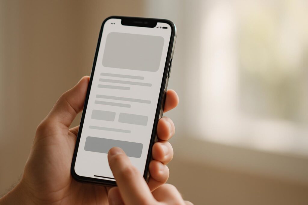
A small e-commerce store in Karachi notices almost half its visitors leave the site within seconds. The culprit? A clunky experience on mobile phones that makes browsing and buying frustrating. In 2026, this is a common story, especially since more than half of web traffic now comes from mobile devices. That’s why mobile-first web design isn’t just a trend, it’s a must. It means designing your website starting from the phone screen up, making sure everything works smoothly for users tapping and scrolling with one hand on slower mobile networks.
At SEO Masters, we build websites with mobile-first web design as the default approach, not an afterthought. That means we focus on thumb-friendly navigation, readable fonts, fast loading, and simple menus from day one. This kind of design can make the difference between a shopper staying or bouncing right away. By the end of this article, you’ll know how to create or improve your site so it feels great on phones, helps visitors easily find what they want, and keeps them clicking “buy” instead of closing the tab.
Why Mobile-First Web Design is Crucial in 2026
Picture a furniture shop in Lahore whose website looks great on a desktop but is a nightmare on a phone. The menus are tiny, images load slowly, and checkout feels complicated. Most customers won’t stick around long. That’s the situation many businesses face because more people in Pakistan browse and shop using their smartphones, often one-handed and on slower networks.
Mobile traffic dominates the web now. More than half of website visits come from mobile devices rather than desktops. This shift isn’t new, but its impact keeps growing year by year. If your website isn’t built with phones as the priority, it can feel clunky and frustrating to users. That leads to lost sales and wasted marketing budgets.
Google noticed this change too. It switched to mobile-first indexing a while ago, which means it primarily looks at the mobile version of your site to decide how to rank it in search results. If your mobile site is slow, hard to read, or doesn’t work properly, your rankings will suffer. Desktop-only designs won’t cut it anymore.
Mobile-first web design means starting your design process with the mobile experience, not shrinking a desktop layout down. That includes thumb-friendly buttons spaced wide enough apart, readable fonts without zooming, fast-loading images compressed for mobile data, and simplified menus that don’t confuse users. It’s about making the site work perfectly on a typical mid-range phone, like many shoppers use here in Pakistan.
Ignoring mobile-first design is one of the biggest mistakes a business can make in 2026. It’s like opening a store in a busy market but locking the door for half your customers. Mobile users expect speed and simplicity. They want to find what they need without pinching, scrolling endlessly, or waiting ages for pages to load.
At SEO Masters, we build every website mobile-first by default because we know that’s where your customers are. Designing with phones in mind first means higher engagement, better conversions, and search rankings that reflect users’ actual browsing habits. Skip this and you’re handing visitors over to competitors with friendlier mobile experiences.
Core Principles of Mobile-First Web Design
When you build a website with mobile-first web design, the goal is simple: make it easy and pleasant to use on a phone before thinking about larger screens. That means every design choice should help people who browse your site one-handed, often on slower mobile networks, sometimes using older phones. If your design feels cramped or complicated, visitors won’t stick around long enough to become customers.
Thumb-friendly navigation is a big deal. Those tiny tap targets on some sites drive users nuts. Buttons and links should be large enough to tap easily without zooming in or accidentally hitting something else. A good rule of thumb? At least 44 pixels square for tap areas. Menus should be simple and usually hidden behind an icon or at the bottom, where thumbs naturally reach. If visitors have to hunt around for how to buy or contact you, you’re losing sales.
Font size is often overlooked but crucial. Text that’s too small forces users to pinch and zoom, which is frustrating on mobile data. Aim for a minimum of 16 pixels for body text. Headlines can be bigger but avoid fancy fonts that don’t render well on all devices. Clear, readable type keeps people engaged longer.
Page speed is another pillar. Mobile networks aren’t always fast, especially outside big cities in Pakistan. Compress images, avoid heavy animations, and minimize code wherever you can. A slow page kills conversion rates faster than almost anything else.
Simplified menus and navigation structures make your site more intuitive. Strip away extra options that don’t add value on mobile. Keep the user focused on the core actions you want them to take, whether that’s browsing products, reading reviews, or completing a purchase.
Testing on Real Devices Matters
One mistake many businesses make is designing for phones by shrinking a desktop view in a browser window. That doesn’t reflect how real people use their phones. You should test your design on actual mid-range devices like a Samsung Galaxy A series or a Xiaomi phone popular in Pakistan. This helps you catch issues with load times, tap target sizing, or font readability that aren’t obvious on a desktop screen. Trust me, your visitors will notice the difference, and so will your sales.
Step-by-Step Guide to Implementing Mobile-First Web Design
Start with the smallest screen and work your way up. That means designing your mobile layout before thinking about how it looks on a big desktop monitor. This helps avoid piling on features that clutter the screen and slow down performance.
- Sketch the Mobile Layout First. Use paper or digital tools to plan key elements like navigation, buttons, and content blocks. Keep it simple. Imagine someone scrolling one-handed while waiting for a bus in Lahore.
- Choose Thumb-Friendly Navigation. Place menus and buttons where thumbs naturally reach, usually the bottom half of the screen. Avoid tiny tap targets that frustrate users on older or smaller devices common in Pakistan.
- Pick Readable Fonts and Sizes. Text must be legible without zooming. Use at least 16px font size for body text and ensure headings stand out clearly. Avoid fancy fonts that slow loading times or don’t render well on all mobile browsers.
- Compress and Optimize Images. Large image files kill load speed, especially on slow mobile data. Tools like TinyPNG or Squoosh help shrink files without obvious quality loss. Serve images in modern formats like WebP if possible.
- Build Fast-Loading Pages. Strip out unnecessary scripts and plugins. Test loading times on 3G or 4G connections. Even a second or two delay can push customers away, especially in smaller cities where data speeds vary.
- Keep Menus Simple. Avoid deep dropdowns or complicated navigation trees. Use collapsible menus or hamburger icons that expand on tap, so users don’t get overwhelmed.
- Test on Real Devices. Don’t rely only on browser resizing tools. Try your design on actual mid-range smartphones like Samsung Galaxy A series or Xiaomi models popular in Pakistan. You’ll catch awkward button sizes, slow load times, or font issues that lab tools miss.
Most businesses don’t realise how much they lose by skipping real-device testing. Mobile-first web design means you’re prioritising the people who matter most, mobile users juggling data limits and small screens.
If you want to skip the guesswork, professional support from web design and development services like SEO Masters can save time and avoid costly mistakes. They start every project mobile-first by default, focusing on smooth user experience across all devices.
Mobile-First Web Design vs. Responsive Design: What’s the Difference?
Most people confuse mobile-first web design with responsive design because they both aim to make websites usable on phones. But they’re not the same thing, and knowing the difference can save you time and money.
Responsive design means your website adjusts its layout based on the screen size. You start designing for desktop and then tweak the layout so it fits tablets and phones too. It’s like resizing a big poster to fit a small frame. If you’re working with an old site that was built for desktops, responsive design usually makes sense because it’s less work than building a new site from scratch.
Mobile-first web design flips that around. You start with the smallest screen first, figuring out what’s most important because the space is tight. Then you add more features and content as the screen gets bigger. This approach forces you to focus on the essentials and user experience on phones before anything else. Since most people in Pakistan browse on smaller, slower devices, this approach usually works better.
Take a look at these differences in practice:
- Design Order: Responsive design starts with desktop, mobile-first begins with the phone.
- Performance: Mobile-first design typically loads faster on phones because it’s built with those limits in mind.
- User Experience: Mobile-first is better for thumb-friendly navigation and readable font sizes since those get priority early on.
- Development Effort: Responsive can be easier for existing desktop sites but might carry unnecessary desktop features on mobile.
Imagine a local clothing store in Islamabad trying to sell online. A responsive site might look fine on a big screen but be cluttered on a phone with tiny buttons and slow load times. A mobile-first design would make their shop easy to browse on a small screen, focusing on quick access to product categories and clear checkout options.
In 2026, Google’s mobile-first indexing means your site is judged by how it performs on mobile devices. So, mobile-first web design is winning ground fast because it’s built with the phone user front and center. Responsive design still has a place, especially when budgets or legacy sites come into play, but mobile-first is usually smarter if you’re building new or redesigning.
If you want a website that truly works for most visitors in Pakistan, start with the phone screen first. Ignore that at your own risk.
Common Mistakes in Mobile-First Web Design and How to Avoid Them
One big trap many fall into with mobile-first web design is thinking that shrinking a desktop site to fit a phone screen is enough. It’s not. That approach often leads to tiny buttons and cluttered pages that make users tap the wrong thing or give up altogether. Let’s talk about the most common mistakes and how you can skip them.
- Ignoring tap target sizes: Small buttons or links are a nightmare when someone’s using one hand on a small screen. Google actually recommends tap targets of at least 48 by 48 pixels. If you miss this, expect frustrated users and lost sales.
- Overcomplicating navigation: Trying to stuff every menu item and feature into a mobile screen makes it hard to find anything. Keep menus simple and limit them to must-haves only. Big, clear buttons beat fancy dropdowns every time.
- Neglecting mobile network speeds: Not everyone has fast 4G or WiFi. Heavy images and scripts kill load times on slower networks. Compress your images and trim unnecessary code. That’s basic but often skipped.
- Using overly complex layouts: Fancy grids or multi-column designs might look great on a desktop but confuse mobile users. Stick to single-column layouts that scroll vertically. It’s easier to follow and less prone to mistakes.
- Tiny clickable elements: If users have to zoom in just to tap a button, you’ve made it too small. Bigger tap areas save time and reduce errors, improving engagement and conversions.
A quick example to keep in mind
Imagine a furniture shop in Lahore with a mobile site that tries to show every product category right on the homepage in small tiles. Visitors end up tapping the wrong category and bouncing quickly. Now picture the same site showing just four main sections with big buttons and clear labels, loading fast even on 3G. That’s mobile-first web design done right. Simple wins over fancy.
My advice? Design your phone screen layout first and test it on a real mid-range device. Don’t just resize your desktop browser window on a laptop. Focus on big buttons, short forms, and quick load times. It sounds basic. But that’s exactly what most websites get wrong, and it hurts user experience and sales. Skip the complexity and make life easy for your visitors.
What to Measure and Track for Mobile-First Web Design Success
You can’t improve what you don’t measure. When working on mobile-first web design, tracking the right numbers matters more than fancy layouts or flashy graphics. A few key indicators directly show how well your site works for mobile users, especially in places like Pakistan where network speed and device type vary a lot.
First up is the mobile bounce rate. This tells you how many visitors leave your site after seeing just one page on their phone. A high bounce rate usually means your mobile site is frustrating or slow, so people give up. If you’re running an e-commerce site in Lahore, and visitors bounce quickly, the problem could be tiny buttons or text too small to read easily.
Page load speed is another biggie. Mobile networks aren’t always fast or stable, especially outside big cities, so your site needs to load quickly even on slower connections. Google’s mobile-first indexing rewards sites that load fast on phones, but that’s just part of it. You also want to avoid heavy images or complicated code that bog down the experience. Tools like Google PageSpeed Insights or WebPageTest can give you clear data on your mobile load times and point out what to fix.
Tracking User Interaction Metrics
Clicks, scroll depth, and time spent on pages tell you if visitors are actually engaging. If users never scroll down a page or avoid your menu, that’s a sign your design isn’t user-friendly. Setting up heatmaps with tools like Hotjar or Microsoft Clarity can show you where users tap or get stuck on mobile screens. This raw feedback can be more useful than just numbers because you see exactly what’s confusing.
Don’t forget form completions or checkout conversions as a success marker, especially for online stores. Shorter forms and bigger tap targets should boost these numbers, so track them closely after redesigns.
One practical way to keep all this in check is to test your site regularly on a real mid-range phone and on mobile data that matches your average customer’s connection. Emulators don’t catch everything. For a bit of extra help, visit related guides on this topic for solid advice and tools that can make your mobile-first web design project a success.
Budget and Timeline Expectations for Mobile-First Web Design Projects
Setting a budget for mobile-first web design can feel tricky, especially when you’re running a small business in Pakistan where every rupee counts. The truth is, if you start with the mobile experience in mind, you often save money later because you avoid costly redesigns and lost sales from a poor mobile site. Think of mobile-first web design like fixing your shop’s entrance so people can walk in easily, this upfront effort leads to happier customers and more sales.
For a typical small business website, building a mobile-first design might take anywhere from four to eight weeks. This depends on how complex your site is and whether you’re adding features like online payments or product filters. A simple e-commerce shop selling clothes in Lahore, for example, could expect a timeline closer to the four-week mark if the design is focused and straightforward.
Costs in Pakistan vary widely. A basic site with mobile-first design might start around PKR 50,000 if you hire a local freelancer or small agency. More polished sites with custom features, fast loading setups, and thorough testing could push upwards of PKR 150,000 or more. That’s not cheap for some, but it’s a solid investment because Google’s mobile-first indexing means your site’s mobile version is what counts for ranking.
Balancing Cost and Quality
Going for the cheapest option sometimes means cutting corners on mobile usability. You might end up with a site that looks alright on a desktop but feels cramped or laggy on phones, especially older models common in Pakistan. At SEO Masters, we design mobile-first by default. It’s not just about fitting the screen but making navigation thumb-friendly, keeping load times short for slower data, and choosing readable fonts without squinting.
Here’s a rough idea of what you should expect when budgeting for mobile-first web design:
- Initial design and development: About 60 to 70 percent of the budget, covering wireframes, layouts, and coding.
- Testing on real devices: Crucial for spotting problems that don’t show up on a desktop browser resize.
- Content optimization: Compressing images and fine-tuning text, which saves loading time and improves user experience.
- Post-launch tweaks and tweaks: Usually a smaller slice but necessary to fix any issues users find once the site is live.
Many businesses see better returns by investing properly in mobile-first web design upfront instead of trying to fix a failed desktop-first design later. Actually, that depends on your budget, but most Pakistani shop owners will agree that a smooth mobile experience directly affects sales and customer loyalty more than flashy desktop designs.
Mobile-First Web Design in Pakistan: Local Market Considerations
Pakistan’s mobile users often face unique challenges that designers abroad might not think about. Many people still use older smartphones with limited processing power and smaller screens. Plus, mobile internet speeds can be unpredictable and data packages are often limited. This means your mobile site must be lean and quick to load, or visitors will click away before they even see your offers. That’s a fact that some designers miss entirely.
One-handed usage is another big deal. Imagine someone juggling groceries and scrolling their phone with one thumb. Buttons that are too small or menus that require precision taps just don’t work well here. You want big tap targets and simple navigation to keep things easy. Try to avoid complicated dropdowns or tiny links that force users to zoom in or struggle to hit the right spot.
Menus and form fields are especially important on mobile in Pakistan. Long forms asking for too much info? Skip that. Customers want to get through checkout quickly without frustration. Short forms, auto-fill where possible, and clear calls to action can boost conversions noticeably. It’s not fancy, but it works better than clever designs that look great on a desktop but fail on actual phones.
Design Tips for the Pakistani Mobile User
- Keep image files small and compressed, many users are still on 2G or 3G.
- Avoid heavy scripts that delay page rendering. Speed matters more than animation.
- Use fonts that stay readable on small screens. No one wants to squint.
- Plan your layouts around thumb-friendly zones for easier one-handed use.
- Test designs on real mid-range devices common in Pakistan rather than just resizing desktops.
Picture a furniture shop in Lahore that redesigns its website with these ideas. The owner tests the site on a Samsung Galaxy A12, not just on a computer browser. They simplify menus, shrink images, and increase button sizes. The result? More people stay longer and complete their purchases without calling for help. It’s simple but effective.
Good mobile-first web design starts with understanding your user’s environment. In Pakistan, that means respecting their devices, connectivity, and how they hold their phones. SEO Masters builds this approach by default, not as an afterthought. This local angle can make or break your online success. Some designers ignore it and you pay the price. Don’t be that business.
Examples of Good and Poor Mobile-First Web Design Patterns
Let’s picture a clothing shop in Lahore launching its online store. The owner wants to attract mobile users because most customers browse on their phones while commuting or waiting in line. Here’s how mobile-first web design can make a difference by comparing two approaches.
Good Mobile-First Web Design in Action
- Clear, thumb-friendly navigation: The menu uses large, well-spaced buttons at the bottom of the screen so users don’t have to stretch their fingers awkwardly.
- Readable fonts: Text sizes start at 16 pixels and scale comfortably. You won’t need to zoom in to read product descriptions.
- Compressed images: Product photos load quickly even on slower 3G connections. This keeps visitors from bouncing off out of frustration.
- Simplified menus: Instead of cramming categories into a long list, the shop groups clothing by type with just a few taps to drill down.
- Fast loading times: The homepage and product pages load under 3 seconds on a mobile network, avoiding lost sales from impatience.
This design is true mobile-first web design because it starts with the phone screen and builds out. The owner tests on a common mid-range Android device used locally to catch any real-world issues.
On the flip side, here’s what a poor design looks like.
Poor Mobile-First Web Design Patterns to Avoid
- Tiny tap targets: The menu buttons are small and tightly packed at the top, making accidental clicks common and navigation frustrating.
- Text too small: Product details use fonts smaller than 12 pixels, forcing users to zoom and scroll sideways.
- Heavy images: Large, uncompressed photos take ages to load on mobile data, causing visitors to leave before the site even appears.
- Complex menus: Multiple dropdown layers confuse users, especially those browsing one-handed on the bus or at a café.
- Slow load speeds: The homepage struggles to load on typical Pakistani mobile networks, killing any chance of converting visitors.
The difference is clear: good mobile-first design fits the real habits and limitations of mobile users in Pakistan. Poor design ignores those needs, creating a bad user experience and hurting sales.
Frequently Asked Questions
What is mobile-first web design and why is it important?
Mobile-first web design means creating your website starting with the mobile version before scaling up to desktop. This approach is important because most users in Pakistan browse on phones, often older devices with slower internet. Google also uses mobile-first indexing, so if your mobile site isn’t good, your search ranking will suffer.
How do I design a mobile-friendly website from scratch?
Start by sketching your design on a phone-sized screen and focus on easy navigation and big tap targets. Use readable fonts around 16px minimum and keep menus simple. Test your design on a real, mid-range phone, not just a desktop browser resized. Compress images to speed up loading on mobile data, which many Pakistani users rely on.
What are common mistakes to avoid in mobile-first design?
Don’t cram too many options into menus or use tiny buttons, it frustrates users trying to tap with their thumbs. Avoid slow-loading images and neglecting font sizes. A lot of Pakistani small businesses waste money on fancy layouts that don’t convert well on phones. Focus on clear calls to action and fast loading first.
How long does it take to develop a mobile-first website?
Typically, a mobile-first website can take four to eight weeks depending on complexity and content readiness. Testing on different devices and fixing issues may add time. If your site has many product pages or special features, factor in more weeks. Rushing leads to mistakes, especially on mobile usability.
Is mobile-first design better than responsive design?
Mobile-first design is often better because it forces you to prioritize what matters on small screens before adding desktop features. Responsive design usually starts with desktop and can ignore mobile frustrations. That said, mobile-first is a type of responsive design that flips the focus, which makes a difference for user experience in Pakistan’s mostly mobile market.
How can I test if my website is truly mobile-first?
Check your site on a real mid-range Android phone using mobile data and try it one-handed. Make sure fonts are readable, buttons easy to tap, and pages load quickly. Also, use Google’s Mobile-Friendly Test for a quick scan, but don’t rely on that alone. Nothing beats seeing how your average customer experiences your site on their phone.
Next Steps for Your Mobile-First Website
Start by taking a hard look at your current website on a real phone, not just a desktop browser resized to mobile. Check if buttons are easy to tap with one thumb, fonts are easy to read, and pages load quickly on slower mobile networks. That simple test alone highlights what needs urgent fixing before investing in bigger redesigns.
After that, focus on trimming down your menus and compressing images so your site feels light and fast. Mobile users in Pakistan often rely on data that isn’t always reliable, so these changes make a noticeable difference. And remember, mobile-first web design means building from the phone up, not shrinking your desktop site.
If you want a hand making these changes or building a new mobile-friendly site from scratch, SEO Masters designs mobile-first by default. Feel free to get in touch, and we can help you get your site working well on every phone your customers use.